My Current Painting
In the past, painting was an expression of reality.
If a cup was painted, one saw a cup; if a teacup was painted, the result was a teacup.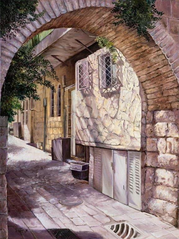
The more precise and realistic the painting, the better it was considered. The highest praise a painting could receive in the past was: “Wow! It looks just like a photograph.”
And so I painted as well. For example, a painting of a nearby alley.
The world has progressed.
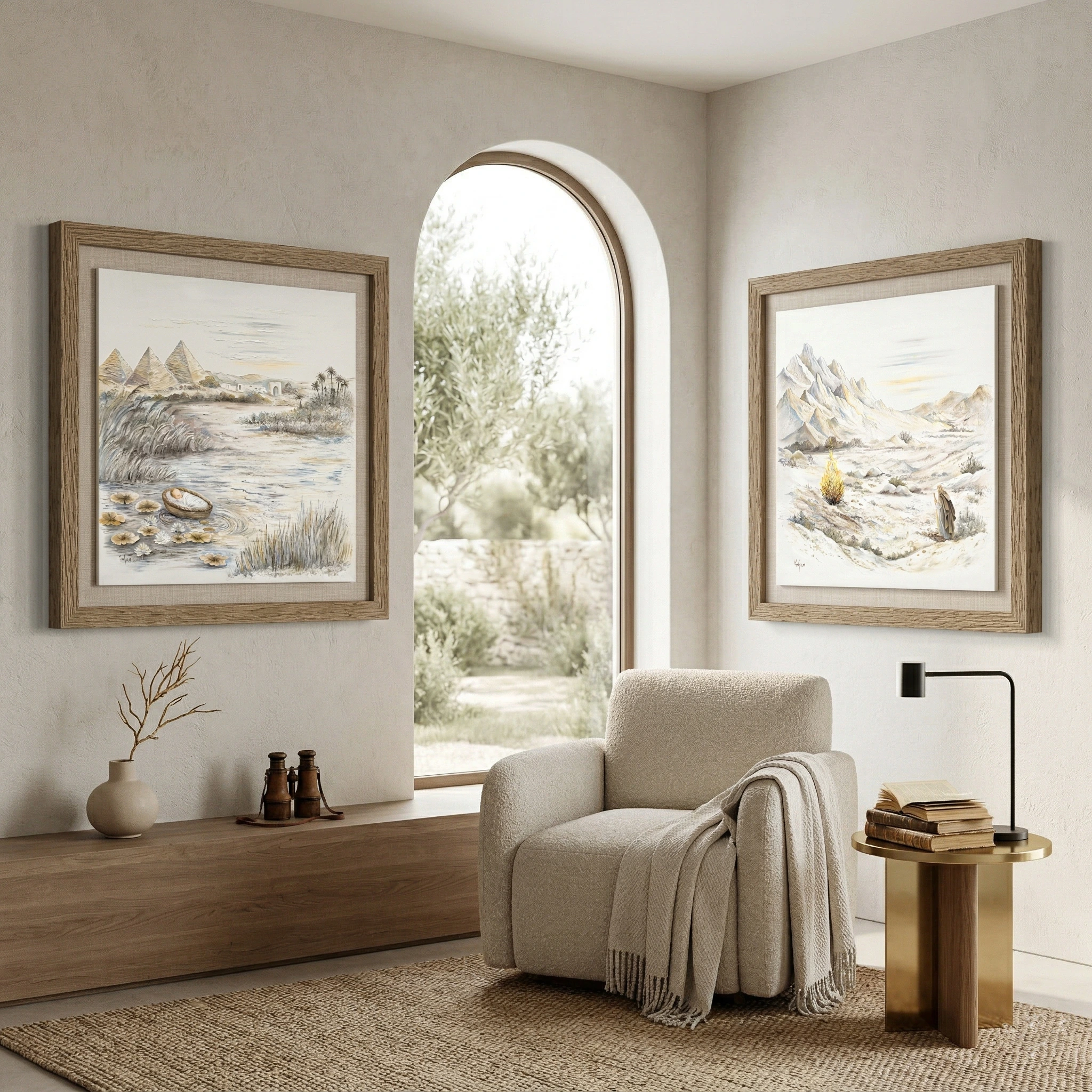
In recent years, design styling has tended toward a smooth, minimalist line, noticeable in many fields.
This includes home interior design and home styling—not anymore heavy, crowded living rooms, but elegant, refined, and streamlined spaces.
Naturally, ambient images and artworks also had to change style and adapt themselves.
As an innovative and evolving artist, I sought to create a style that would suit a home designed in a clean, smooth, and minimalist line.
The transition was gradual, not extreme.
At first, I loosened precision and added color spots. It was really a struggle between spontaneous expression and exact depiction—a change that required effort and thought.
Over the years, I felt the need to loosen even more… to paint more spontaneously, from emotion, from the heart.
I was searching for something interesting and innovative, a style the world had not yet seen. Gradually, I arrived at my current painting style.
This process was accompanied by dedication, practice, experience—and yes! Even tears.
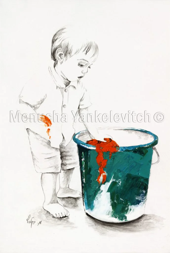
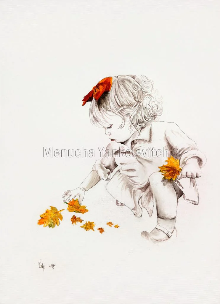
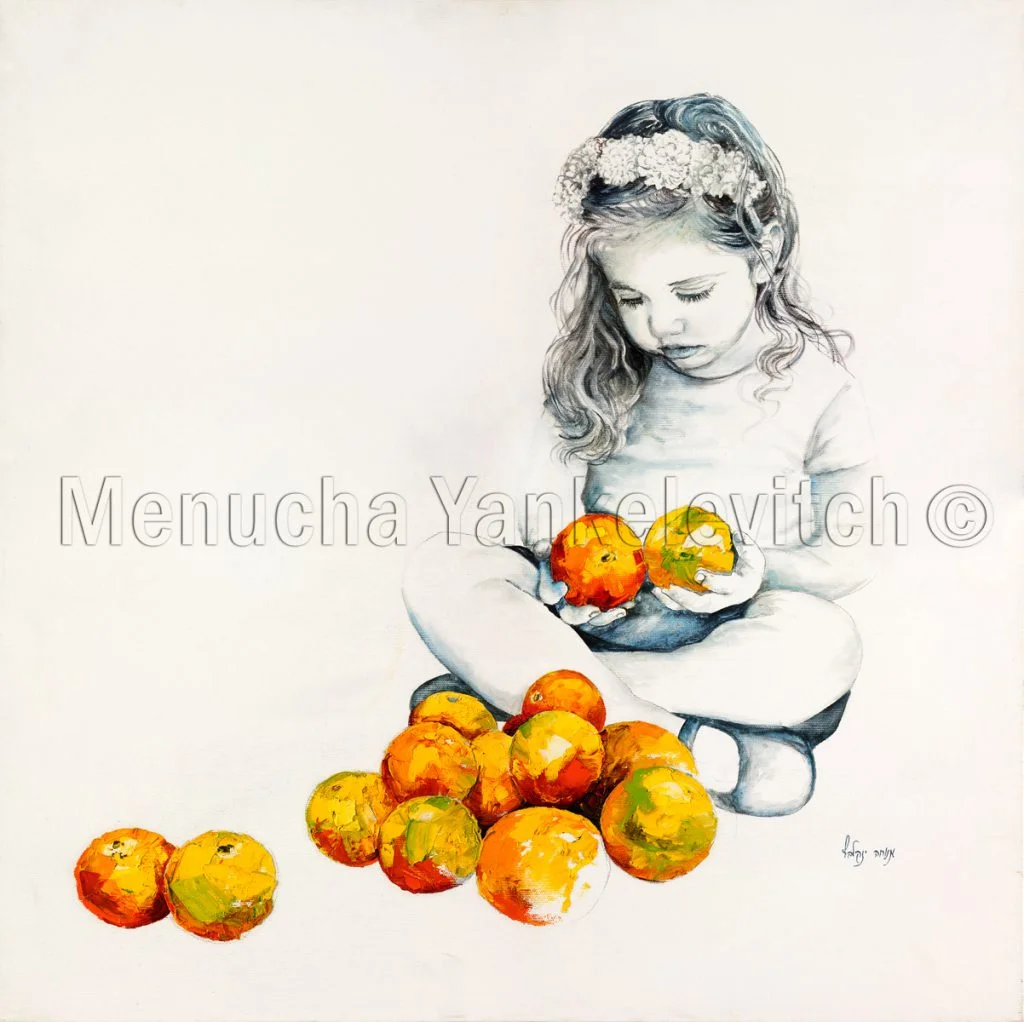
I began with children’s paintings on a white background. The painting was more sketch-like and light, with strong contrasts of colorful spots. I created an impressive series that was very well received.
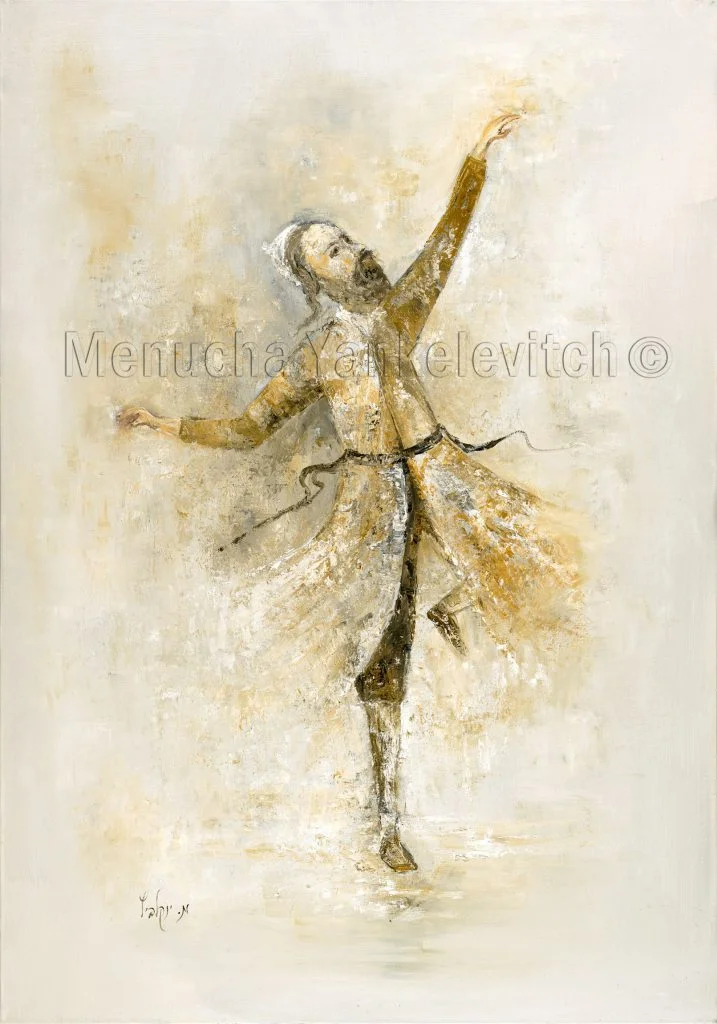
…I invest the core of my heart and emotion into my Judaica paintings. I want to give my clients not only an internal connection to the artwork but also a connection to the Divine.
It was clear to me that this was the path, yet I still struggled to convey this innovative, minimalist idea within the conservative and heavy field of Judaica.
…Until—God placed an idea within me.
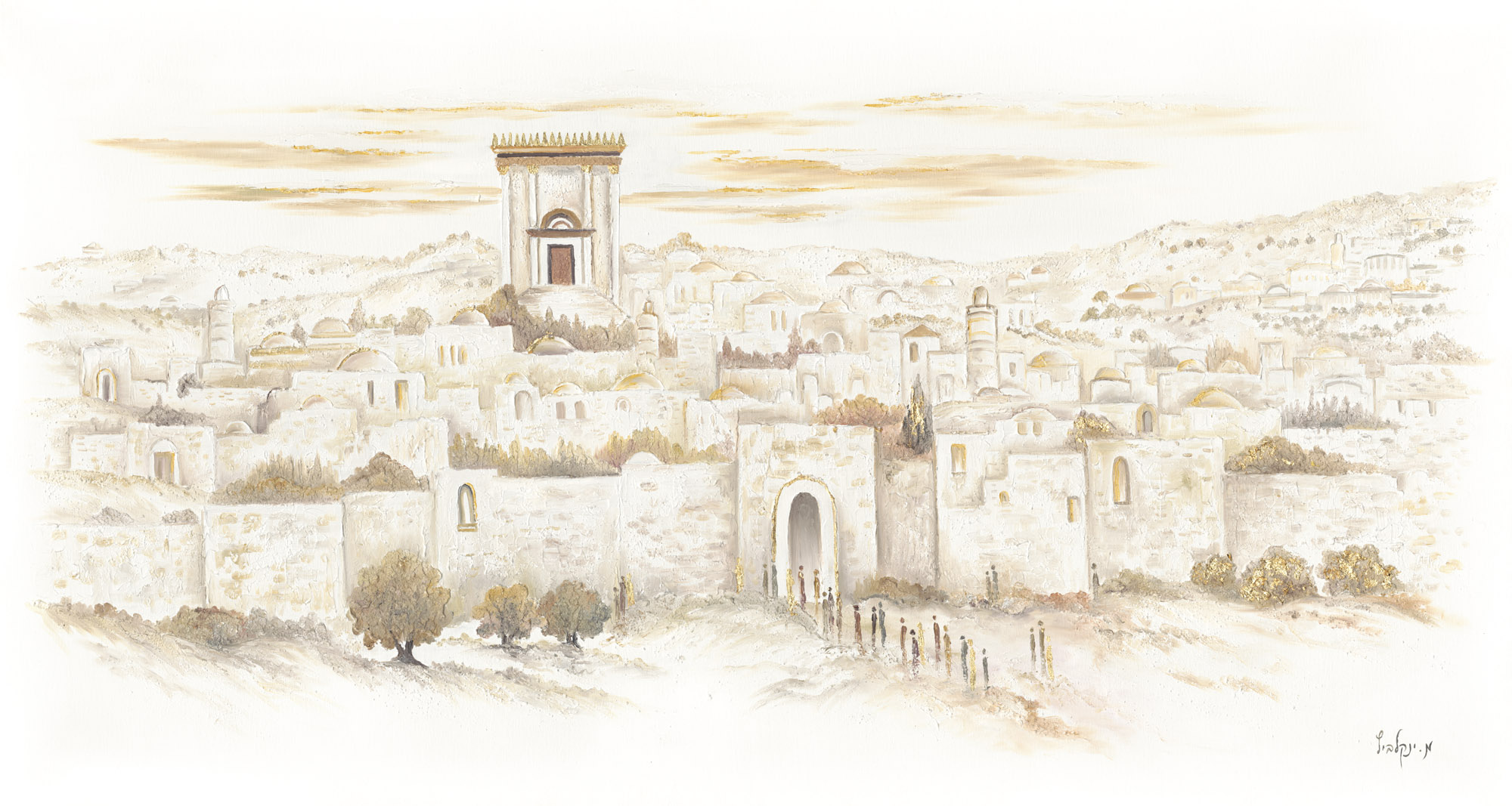
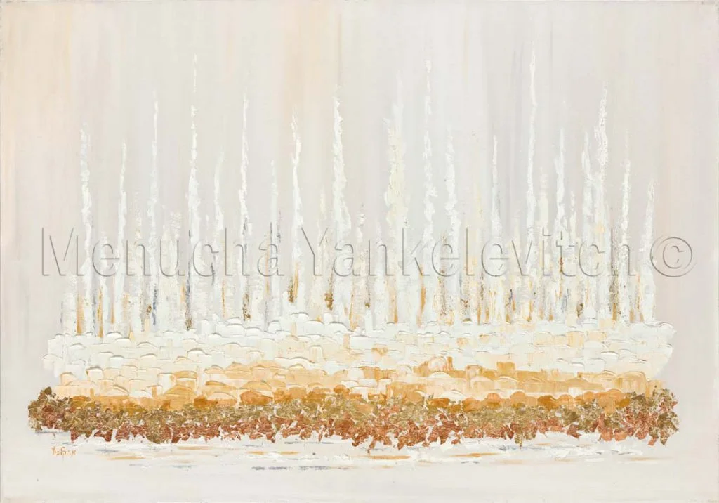
I began with a white Western Wall.
Yes, white, with particularly thick texture.
In striking contrast, I painted the figures of the worshippers in a variety of colors.
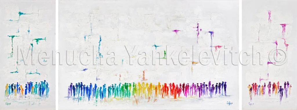
I never imagined myself the excitement that the artwork would generate!
The style was groundbreaking and was received with great admiration. The greatest compliment I received was seeing, after some time…
…similar style paintings by other artists.
Or: All the galleries in New York “whitewashing” copies of your work!
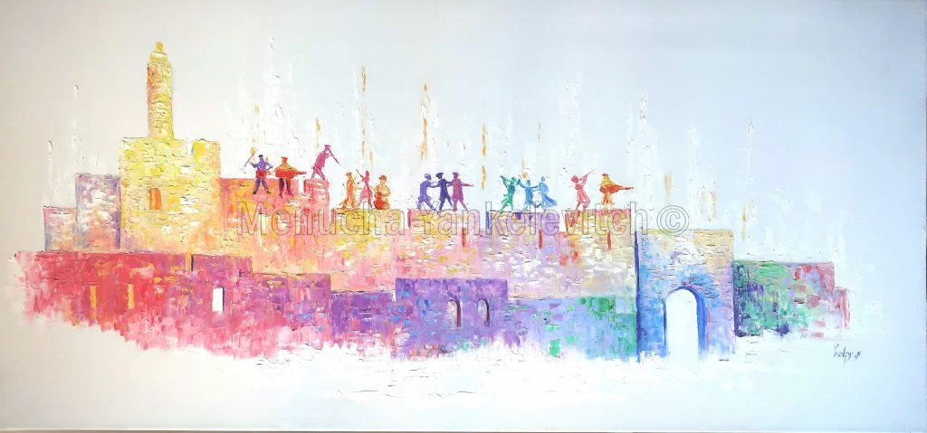
Most of my clients, who are from abroad, want to see Jerusalem, the Temple, and the Western Wall every day before their eyes, to remember and feel the yearning for redemption.
The paintings I created, combining the longing for redemption with the contemporary and design-oriented style of their homes, provide a perfect solution for them.
I realized I was on the right path and continued onward, aiming to create minimalist works with clean lines, yet exceptionally luxurious.
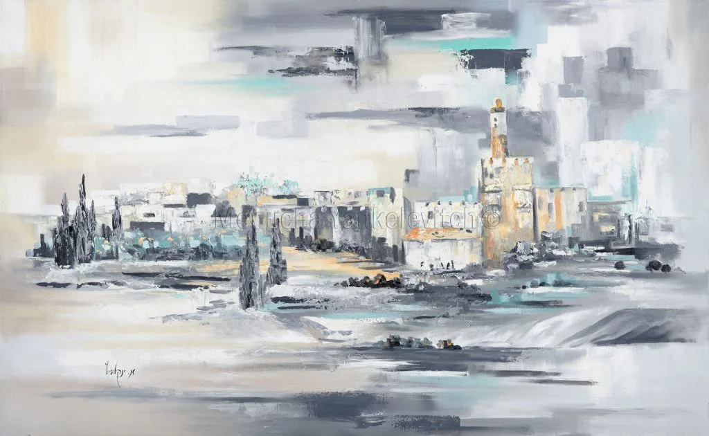
I continued with many paintings in shades of white, gray, and gold, as well as some more colorful pieces.
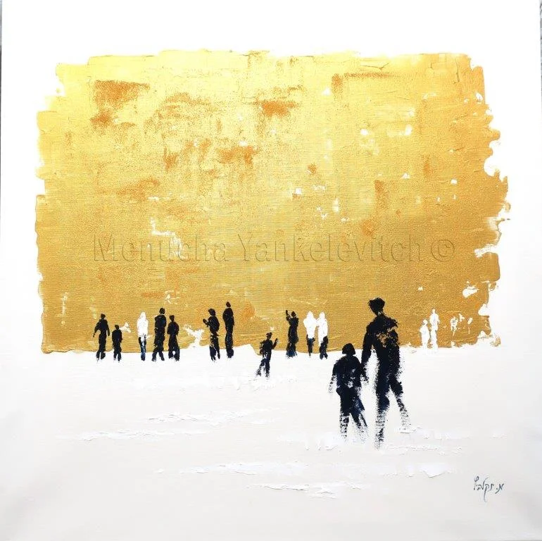
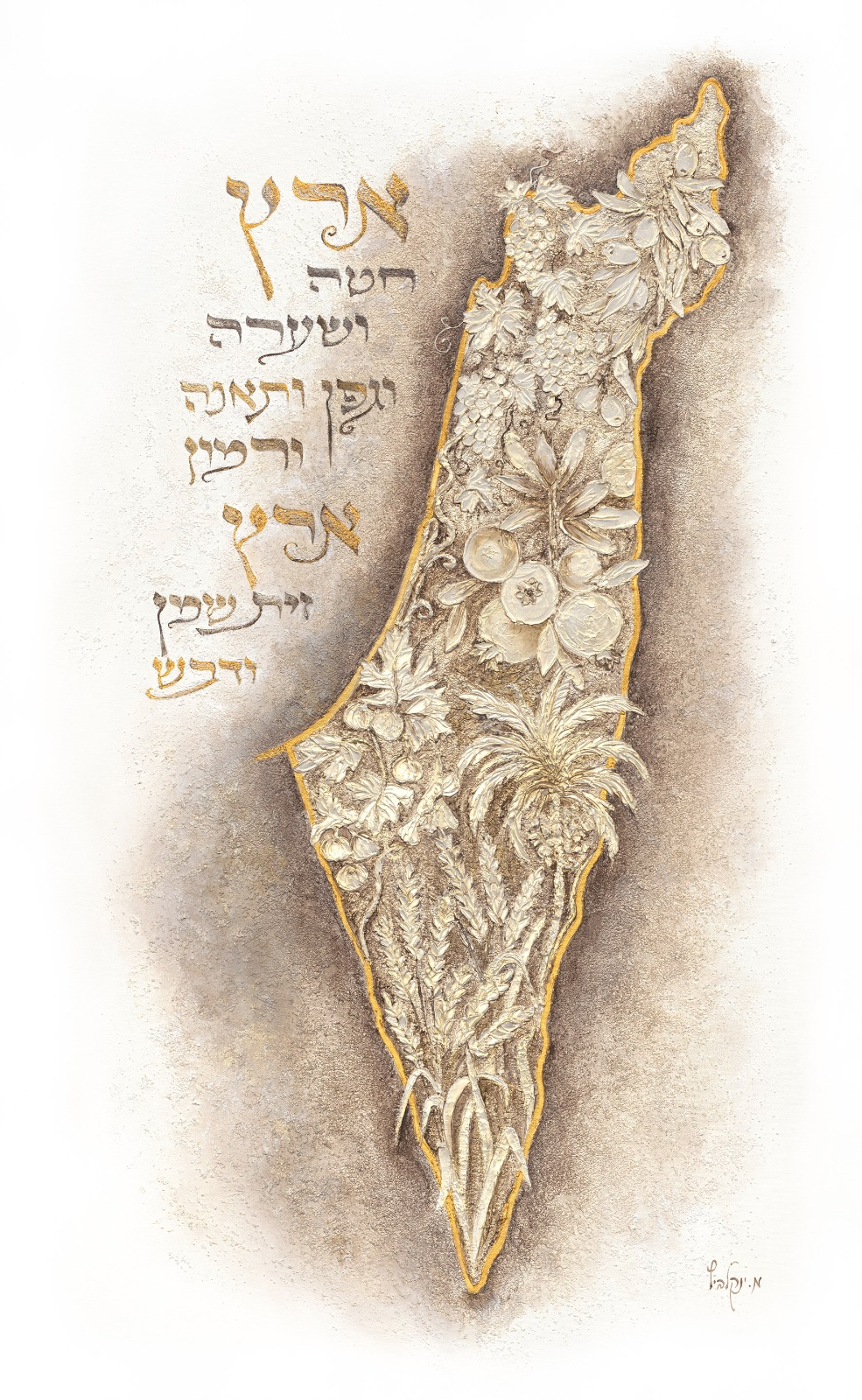
The next series was “Jerusalem of Gold”—paintings of Jerusalem and Jewish heritage sites, combined with gold leaf.
This was also a major innovation that had not existed until then in oil paintings of Judaica.
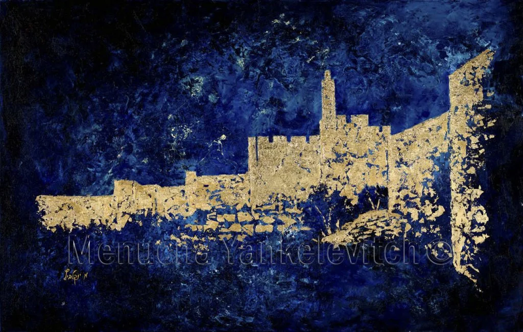
The shimmering glow of the gold leaf adds to the painting, making it appear very luxurious and elegant.
This series is a contemporary, high-end collection and is highly sought after.
My prayer to the Creator is that He continue to inspire my ideas and grant blessing and success in all my work.
You cannot copy content of this page