Look for it in stores — and enjoy!
Some time ago, I received an interesting request — to create a painting that would decorate the label of a wine bottle.
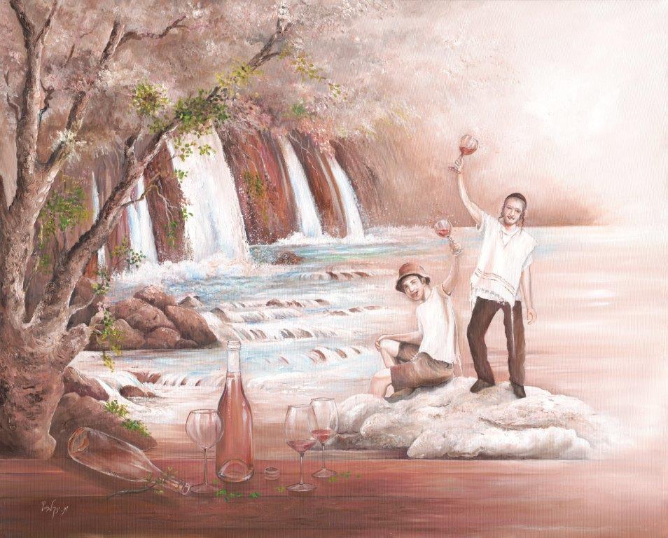
These wine bottles were intended for the ultra-Orthodox community during the vacation period,
and the label was expected to fulfill its role with dignity!
I was happy for the challenge and began a brainstorming session with myself.
I remember my excitement as I sank into the thinking process,
trying to understand what messages the label should convey,
who its target audience was, what ages it should attract,
what would be right to paint on it, which shades and colors to use,
and which style to choose.
After an in-depth conversation with the company owners,
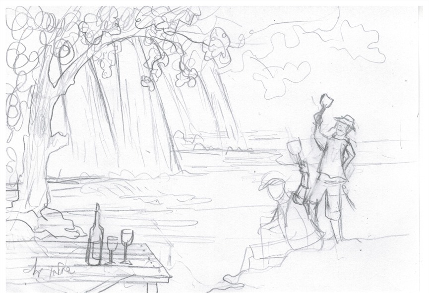
we managed to reach thoughtful answers, and I set out with an initial sketch.
I aimed to express the joy that wine brings — even during weekdays, on vacations, in cabins, and on trips.
The sketch I drew showed two young men standing on a rock in the middle of a rushing stream,
surrounded by waterfalls and greenery.
In their hands were half-empty wine glasses, and joy radiated from their faces.
At the front of the painting, a picnic table with an empty wine bottle and glass cups.
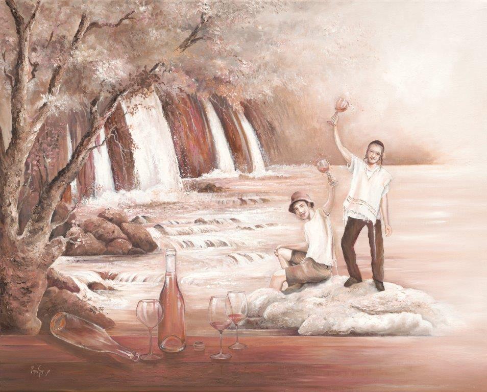
I chose to paint the picture in oil on a large canvas,
even though the work was meant for a small label.
“You can always make it smaller,” I thought to myself!
As for the style, they leaned toward a realistic one,
but I clarified that I would add an artistic touch.
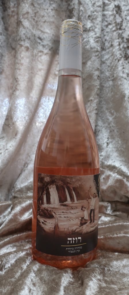
I asked to receive a bottle of the wine at home,
so I could match the painting to the shade of the wine — a rosé with an antique pink color.
Although I was asked to create a bright and colorful painting,
my heart leaned in another direction,
and I began to paint the whole picture in wine tones,
creating a perfect match between the label and the color of the wine.
It was a challenging experience that required a lot of thought and investment!
The unique result, by the grace of God, that came from the tonal painting without bright colors,
was surprising and elegant!
And I felt there was no reason to add more color, which could actually harm it.
And even though, at their request, I made an attempt to add color to the painting,
the final choice was the tonal label — not the colorful one.
You cannot copy content of this page